Author Archives: brandonio21

CODE Keyboard: First impressions

Let me preface this post by saying that I am by no means a typer. I have never really took time to look into what keyboards were good, what keyboards I liked the best, or what keyboards allowed me to type the best. To further prove my point, all of my previous typing was done on the Microsoft Sidewinder X4, a keyboard that I am almost positive lacks merit in the land of keyboards that are “typing” boards.

The world of mechanical keyboards has interested me for quite some time now. Their clicky nature, their claims for faster speeds, the way that they feel while typing. Everyone always had good things to say about mechanical keyboards, and I’ve never had one. Thus, it only made sense that I got one. Following the recommendations of a few friends and of Jeff Atwood himself, I decided that I would go ahead and get the CODE keyboard without a number pad and with Cherry MX clear switches. What this meant, I had no clue. I was more than excited to get started.

I have been using this keyboard for about a day. So far, I love it. Typing feels great, the sound is very satisfying, and the amount of tactile feedback really is incredible. There is no question as to whether or not I hit a key or I just kinda-pressed it. The keys actually depress as you press them, and I think that’s awesome.

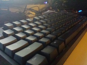
The CODE with LEDs turned off.

The CODE with LEDs turned off.

Build Quality

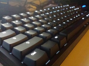
As far as the keyboard itself goes, it feels great. It’s a little on the heavy side, but I don’t think that anyone ever expects a keyboard to be comparable to a feather. After all, all it really does is sit on the desk. The material feels solid, the keys look beautiful, and the paint gives the keyboard a classic look when the LEDs are toggled off, but a beautiful modern look when the LEDs are toggled on. In fact, when I first opened the box for the keyboard, I was a little underwhelmed. Without knowing what it was, it looked just like a normal keyboard. However, as soon as I held it, flipped a couple optional switches, ran the USB wire in its dedicated slot, and began typing, I knew this was no ordinary keyboard. It felt great. It still does.

The Sound

One thing that always interested me about mechanical keyboards was their sound. They sound as if you’re actually typing. Because of that, I was very concerned when picking out a keyboard. Now, I know nothing about the different color switches and which ones are loud and silent and soft, but I wanted to make sure that the keyboard I got had a satisfying sound, while not keeping my roommates awake. This keyboard (with the help of the MX Clear switches) does exactly that. It definitely isn’t too loud, and actually doesn’t require the keys to “click” in order for them to be pressed. The most noise is produced when the keys are fully depressed. However, while typing one will quickly realize that isn’t necessary. A keypress is registered about halfway down. Thus, there is no need to actually “click” the key. Not only does this provide a non-irritating sound profile, but it also gives the typer a little bit of control as to whether or not they want to be a quiet typist or the most annoying computer user in the library (of course, this means that you would have to bring the keyboard with you to the library).

The Feel

So many people raved about this keyboard because they felt “pleasured” to type on it. It was relaxing and it felt great. Honestly, as someone who is not a typing enthusiast, I don’t feel much “pleasure”. So far, I find that it is actually fairly tiring typing on this device. Now, keep in mind that I come from the world of chiclet laptop keyboards, so I definitely do not appreciate the levels of effort required to type on such a well-built device; however, all of the wild claims about this being the “best feeling” keyboard ever made do not resonate with me. As of right now, at least, I do not feel anything special.

Of course, I am not trying to say that the device doesn’t feel good. It feels good. I enjoy typing on it because of its sleek design, it’s clicky-clack nature, and it’s beautiful LEDs. However, I do not think that I would find myself carrying this keyboard around because using anything else would be an abomination and a sign of disrespect to my fingers. If anything, my fingers will need a bit of a break after typing on this device for so long. However, for a typing enthusiast, I can definitely see how this device has potential to feel great. I just don’t notice anything super outstanding.


The CODE with LEDs turned on.

The CODE with LEDs turned on.


Overall, I am very pleased with my purchase. Keep in mind that I have only been using it for a day, so I can’t comment on much, but I am not suffering from any buyer’s remorse, which is always a good sign. If anything, this keyboard is making me want to type more and learn how to actually type properly (I currently type in a strange fashion where 75% of the keys are typed using my index fingers. I will work on changing this soon!) There will be more comments to come regarding the CODE keyboard!
On Dropbox’s Recent Announcement

First off, if you haven’t heard of Dropbox’s new Pro Plan announcement, see it for yourself here.

The Overview

In short, Dropbox has revamped its pro plan to add a couple new things.

  • There is now only one plan option: 1TB for $10/month
  • Shared links can now be password protected
  • Shared links can now be set with expiration dates
  • Shared links can now limit access to ReadOnly/Read+Write
  • Shared folders can now limit access to ReadOnly/Read+Write
  • Unlimited version history for a year

Analysis

It is clear that most of the items on this last are good for the consumer. Let’s take a closer look.

New Price Point

Dropbox seems to have lost their minds just a little bit. Previously, Dropbox was $10/month for 100GB of storage. This is a 10x increase in storage space for users who were already paying for the standard 100GB pro plan. This is a great deal for those who were reliant on Dropbox’s services.

I believe the reason that Dropbox was able to do this was because they realized that a large majority of their customers actually used less than their allocated limits. Thus, they figured that upgrading everyones’ limits would not hurt too much as most people won’t use up to 1TB of space. I doubt that Dropbox has enough storage space to actually house 1TB of files from every single user – but they were confident that not everyone would be utilizing the full 1TB of cloud storage. It is a little insane to put that much in the cloud, after all.

The interesting thing about this price point is that it does not change their base price at all. They still have their free version, but to upgrade from the free version you still need to fork over the $10/month. Thus, this recent pro plan change does not do anything to separate them from their competitors who might offer 100GB of storage for $5/month. Although 1TB/$10 is a pretty sweet deal, Dropbox is not going to be gaining any new customers who are hesitant to pay the $10/month fee.

The main competitor that Dropbox was going against with this price revision, I think, is Google Drive, who is known for their notoriously low price points. Combine these price points with Dropbox’s speed and native clients… that’s enough to make any existing Dropbox customer drool. But it makes me wonder how many old pictures are now going to be hogging all the hard disk space in Dropbox’s headquarters.

Upgraded Sharing

When sharing a file on Dropbox, it was obvious that there was a gap. When sharing from Google Drive, for example, the sharer had the ability to give the receiver specific permissions (whether they could only view, edit, or comment). Dropbox did not have this functionality, causing it to slump a bit when it came to sharing. Either you shared the file or you didn’t. Those were your only options.

With this new update, Dropbox is leveling the playing field just a tad. Just like Google Drive, sharers who use Dropbox to share their files can now specify what people can do with these files. This makes it much easier to collaborate on documents, something that Dropbox definitely didn’t have the functionality to do previously.

Expiration dates on links are a great touch, too. There have been numerous times when I want to share something with a coworker in that moment, but wanted the link to expire so the public could not see it after about 30 minutes. It would serve as a quick interaction between my colleague and I. Since usually I share code, I previously did this through Pastebin. However, now that Dropbox has the functionality natively, I will definitely start using Dropbox for this function.

I think this is a major win for Dropbox. The only downside? Maybe sharing files will take a few extra seconds to make sure that all the permission and expiration settings are correct. I think it’s worth the sacrifice, though.

Version History

Previously, Dropbox’s version history capabilities were only available to those who subscribed to their Packrat service, which provided unlimited version history for all files in the user’s Dropbox folder. Now, this functionality is available to all subscribers for a year.

Of course, Dropbox didn’t eliminate the Packrat service. For those who still want unlimited versioning history, users can opt-in to the Packrat service again, even though it has essentially disappeared from the public eye.

Being a subscriber of Packrat, I know that it can definitely come in handy. I think that this feature being available to everyone is great, as it is a perfect solution for when you’re coding and you forget to setup a git repository and something breaks. Dropbox has your back! (As long as you had an internet connection while creating and editing the files).


Summary

Overall, this upgrade is a major win for Dropbox customers. Although the amount of new customers it may lure in is questionable, it still provides existing customers with a huge slew of new features. I honestly don’t know how Dropbox is able to handle this much data (1TB for each pro subscriber as well as 1 year of backed up versioning history), but I think the primary reason is that not every subscriber will be utilizing the full 1TB of cloud storage space. I know that I probably won’t be.

If you’ve been hesitant to join the Dropbox Pro club, though, maybe this recent pro plan revision will convince you otherwise.

Home Automation

If you have seen the latest addition to my code page, it is my first project that deals with hardware other than standard computers. It deals with the Chromecast. Take a look at the project here.

One of the goals of this project is to make life with roommates easier. In my opinion, it’s the modern alternative to keeping a grocery list pinned to the fridge. I want to make an app in which everyone can add tasks to a task list and everyone can see them just as easily as they appear on the television screen.

This, I believe, is my first step into the realm of “home automation”. Ever since I started toying around with making the tv screen display my things when I want them displayed, I have begun thinking about the possibilities of home automation. One of the things that I would really like to happen is a system in which I tap my phone on an NFC tag and everything turns on. The TV turns on and displays tasks that I need to complete. My computer turns on and becomes ready to use. Coffee is brewed. I imagine a place where I am truly the master of the house.

As I gain more and more knowledge in software development, this is exactly what I will be experimenting with. Right now, I am working on getting my Chromecast to display a task list that is editable from anywhere. The concept is really simple and pretty straightforward, but not knowing most of the technologies behind it makes it challenging. Basically, the following process needs to happen:

“Launcher App” –> Chromecast App –> Node.js App –> Data from MongoDB

This launcher app needs to be launched manually. However, as long as the launcher app exists as a mobile app, I can make it launch when the phone detects a specific NFC tag. Adding tasks is a little more straight forward.

AngularJS –> ExpressJS –> Node.js –> MongoDB

Also known as the MEAN stack, this is the process that I plan to use to power the backend of the task management. As the project progresses, hopefully I will be smart enough to make it into a deployable package so that anyone with a Chromecast and roommates has the ability to setup a communal living room task list.

During the development of this small system, I’ve been listening to a lot of older songs, especially those featured on Radio New Vegas. Here’s one of my favorites:

I Dislike The Mouse


My Desktop

The above picture is a screenshot of my Linux machine. What is unique about it? Well, everything is controlled by the keyboard. I have a tiling window manager (i3) and do all of my text editing in vim. What does this mean? It means that I rarely touch the mouse.

I grew up using Windows. It was my primary operating system for the past 10 or 11 years. I got very used to it, its semantics, and using the mouse+keyboard combo in order to navigate around my Windows machine. There was nothing wrong with it. As I got more into computers, however, I got bored of using Windows. There’s nothing wrong with the operating system – I just got bored of using the same thing for 10 straight years. Because of this, I installed Linux.

When I first install Linux, I tried to emulate my Windows experience as much as possible. I installed LXDE as my desktop environment and Openbox as my window manager. I used these just like I used Windows.

As I used Linux more and more, though, I realized that most of the power of Linux was not in the interface, but rather, the terminal. This led me to be in the terminal a lot more than I ever was. I no longer needed a file manager as I did all of my file operations in the terminal. I no longer needed desktop icons because I launched everything in the terminal. Eventually, I no longer needed my mouse to switch Windows, as I just used keyboard shortcuts. I no longer needed my mouse to open terminals because I used keyboard shortcuts.

What did I need my mouse for, then? I decided to experimentally ditch the mouse entirely and switch to a tiling window manager that allowed me to manipulate my windows and their positions by just using the keyboard. At first, I used Awesome. However, Awesome felt very static. In order to move windows around, I had to switch the layouts entirely. I wanted something more dynamic, so I switched to i3.

It definitely took some getting used to. I had to train myself to not reach for my mouse every time that I wanted to do something. Eventually, however, I got used to it. Once I did, it felt awesome. It made me feel like a whole new breed. I was able to rearrange windows, launch applications, and do everything from my keyboard. Not to mention that when my mouse isn’t around, it has the added bonus of keeping people from using my computer since they don’t know how to use things.

As I practiced more and more, I felt that I was getting faster and faster. In fact, I felt that I was doing things faster than if I needed to reach for my mouse. Need to listen to Spotify and type some notes at the same time? Easy.
<WINDOWS>+3 – Switch to a new Desktop
<WINDOWS>+D – Open the app-launcher
‘spotify’              – Launch spotify
<WINDOWS>+B – Open the next window to the right of Spotify
<WINDOWS>+<ENTER> – Open a terminal window
‘vim notes.txt’   – Launch vim and write some notes
Of course, this is a lot of steps, but they can be executed very quickly without reaching for the mouse to resize the windows in order to get the right proportions between the vim and Spotify windows.

Of course, as time goes on, I will only get faster and faster. However, this experience has made me realize that I really dislike using the mouse. Of course, this experience is only on my laptop, where I often find myself reaching for my touchpad because it is easy to reach with the keyboard so close. However, I plan on getting a new Desktop soon and installing Linux on it with my i3 setup. I am excited to see how everything will end up working out on my setup with two monitors and so much screen space. I will report back.

If you’re wondering whether or not you want to take a shot at using a computer without the mouse, try it. It’s a great experience and it looks super awesome whilst doing it.

Music

As I work, one of the primary things that keeps me going strong is the music I listen to. The previous sentence sounded like something straight out of a bad commercial.

I’m serious, though. Nothing helps me get in the zone more than a good song. With that being said, I find that the best music for programming is music that is not too distracting, but soothing, melodic, and rhythmic. Although classical music is a perfect fit for these expectations, I tend to favor something a little more electronic.

What do I mean when I say electronic? Well, electronic music has actually formed into its own genre. Whenever someone says electronic music, most people think of today’s standard EDM. What is this standard? Generally the tracks involve a catchy melodic build-up, a seemingly uncalled for shift (the drop), which is usually preceded by vocals such as “Jump”, “Get Down”, or other words suggesting immediate action, and then a melody with a very distinct beat that is easy to bob your head to.

Fortunately, this is not the type of music that I listen to. I like to listen to progressive house music or trance music. Why? Because it has a calm feeling to it. The songs are not derived from the party formula, but instead are composed to meet the creator’s expectations. I love consuming media that was created out of pleasure. For instance, deadmau5, Madeon, Daft Punk, and the new Porter Robinson are among my favorites, as they create music not for the fame, but because they want to, and they’re very good, too.

As I become more active on my blog, I want to share the music that I listen to. Inspired by posts by Sauropod Studios  as they develop a game that I’ve been anticipating for a while, I also want to post music that I’ve been listening to. Not only will it allow songs that I like to get more exposure, but it will also allow other developers to discover new music.

I am really in love with Porter Robinson’s new album, Worlds.

As time has gone on, I have been trying to find the perfect program to listen to all of my music on. When Spotify first came around (somewhere around 5 years ago? It wasn’t even available in the US), I quickly signed up for the beta and used a proxy to consume all of the media that I could. However, one thing that always bugged me about Spotify was the fact that it didn’t allow local uploads to be synced across devices or shared in playlists. What good is music if it can’t be shared with others? Atleast, that seems to be the biggest selling point of the entire Spotify platform itself.

Because of this, I ended up going with Google Play Music (All Access) for about 6 months. I was very happy with the experience, and the ability to listen to all of my music from the web, upload all of my local music, and see how many times I’ve listened to songs made me very happy. However, the problem with Google Play Music (All Access) is the same problem that Google+ has. All of my friends use the competitor. What does this matter? Well, if I want to see what my friends are listening to, receive songs from my friends, and be “in the loop”, I need to conform and use the same service that they do. That is the reason that I have stayed on Facebook for so long, and that is the reason that I switched away from Google Play Music (All Access) and got myself Spotify Premium.

Of course, I was pleasantly surprised when I learned that Spotify offers a 50% discount to students, which allowed me to gain more profits than I was expecting, which is always a plus! Plus, being able to access all of my friends’ playlists is actually something that I really love.

All in all, I must say that both music platforms have their advantages. Both are solid. However, Spotify is currently the winner. Given enough time, I do believe that Google Play Music (All Access) will pull ahead, though!